Telus: Internet Meganav (Wayfinding)
All Purpose Creative was a preferred vendor for Telus, Canada's second largest telco. This project became part of a broader initiative to increase their product sales on their e-commerce site. We were tasked with designing an effective wayfinding system to help convert prospective customers to Telus internet products via their 'meganav' menu.
Ask
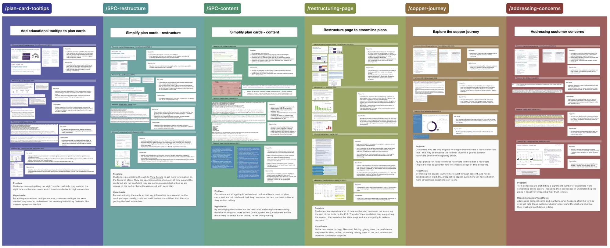
Telus's internet and mobile plan browsing journey was buried several layers deep in the site's legacy navigation, causing drop-off before customers ever reached pricing or plan comparison pages. We were brought in as a third-party design team to assess potential directions to circumvent the issue, which meant working with their internal design teams and the sales team that brought us on as a key collaborator.
Highlight/s
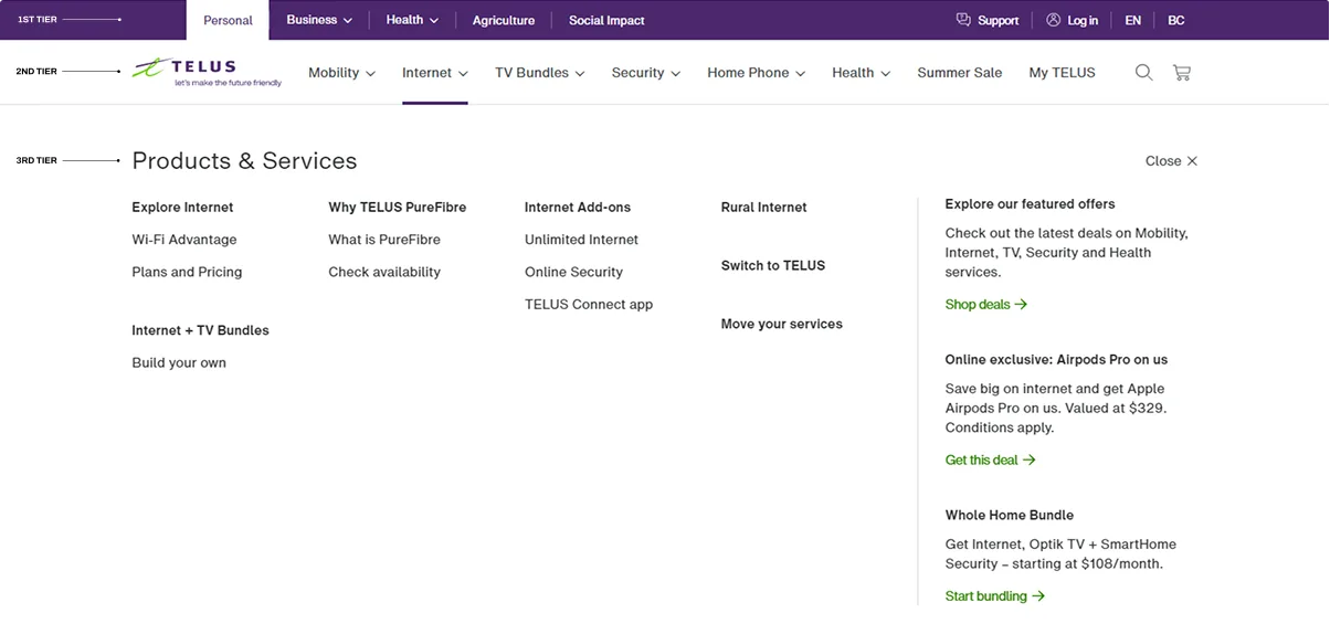
When auditing the existing menu and site architecture for the internet flow, it was clear that there were a number of pages surfaced earlier than they should be, which clouded the overall experience even before clicking through.
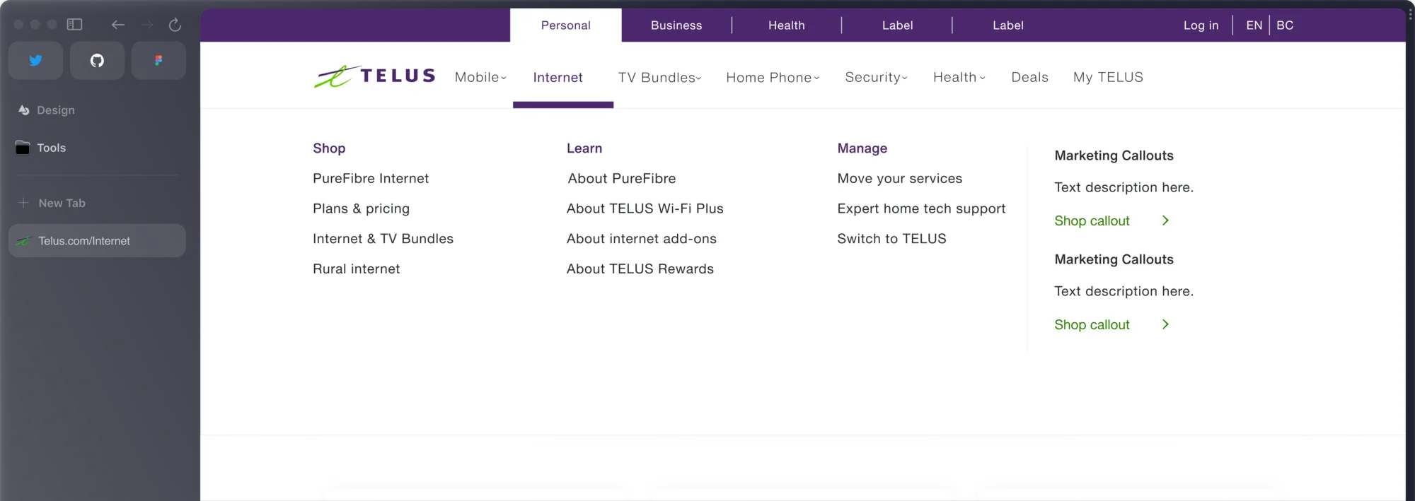
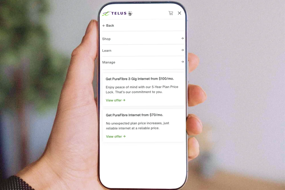
After extensive research (card sorting, user interviews, A/B tests), the other researcher and I restructured the menu and tweaked the content, so the flow was simplified. This meant the pages were more purposeful for the audience they are trying to attract (like prospective internet customers identifying more with the Learn menu items compared to the Manage section.)
We identified Telus' customer needs for menu items and labelled them as follows:
- Recognizable Labelling: customers need to know what they are 'getting themselves into' when clicking on a menu item
- Easy to Use: seeking an intuitive experience on desktop and mobile, rather than flipping between pages to wayfind
- Match Expectations: they are satisfied with the info on the page that is linked to the menu item they select
Contribution
- Audited the existing navigation and mapped every drop-off point in the internet sales journey, assessing the click through rate of each menu item
- Restructured the site IA to focus more on action-based interactions at a higher level
- Partnered with a user researcher to run usability testing and, eventually, A/B tests validating the new structure pre-launch
Results
Plans Page from the menu
page visits after launch
Project media
Here are some key artefacts from the project, with captions explaining each of them.